Tristan Griffith
December 2nd, 2023
Pups and Cups Rebranding Case Study
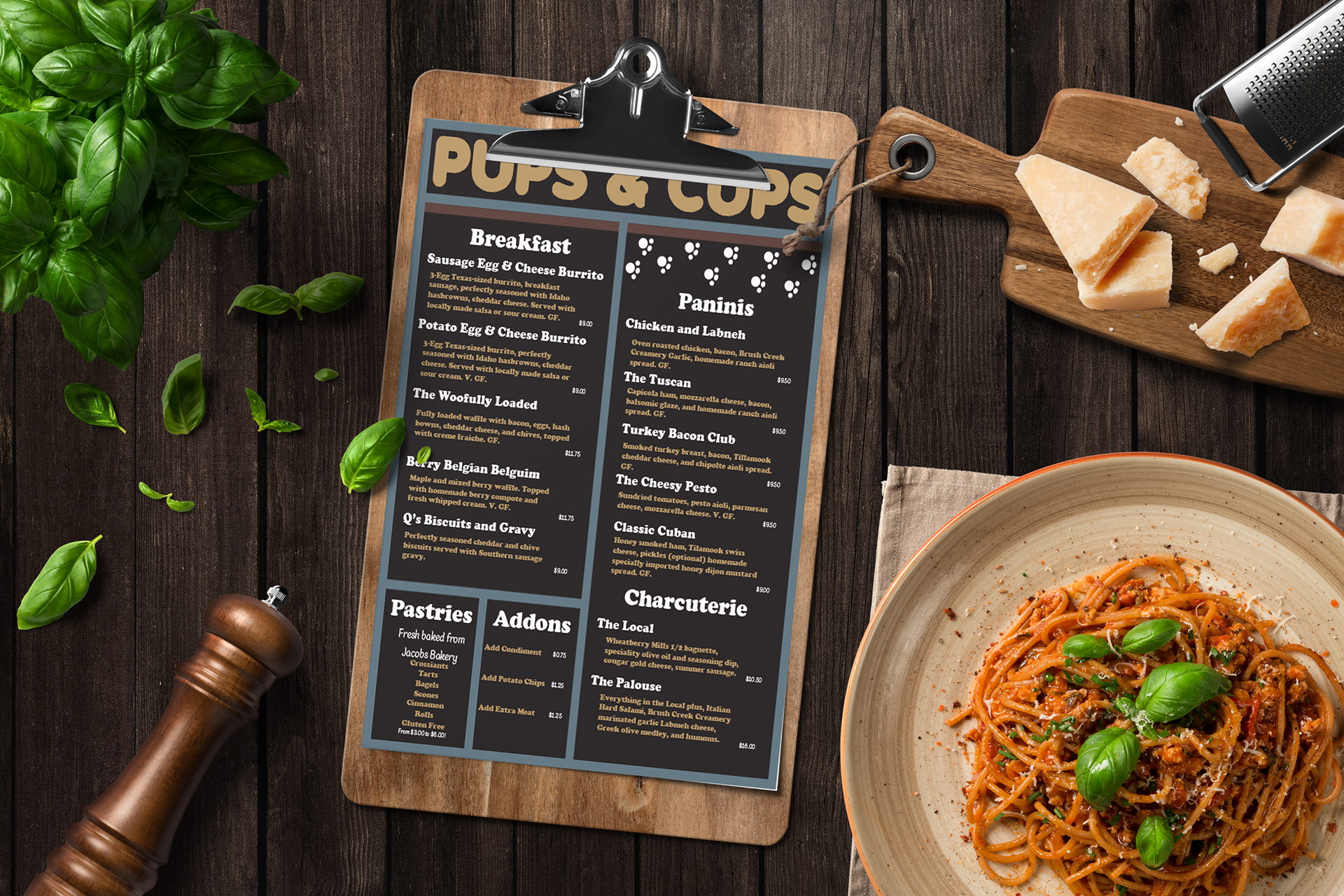
When I was originally tasked with rebranding a restaurant in the local area of choice with a group, I was extremely worried. I didn’t really have a good grasp of what would work and whether or not I could actually do it. But as time went on, and with every step that was taken with my team, I felt more confident about my abilities and the menu and backside I did end up designing. I feel like I contributed exactly a 3rd of what we as the team did, as each of us split up the main aspects of the work evenly. For example, the three of us made our own separate logos, and then we combined each logo in the form of the actual logo we have.
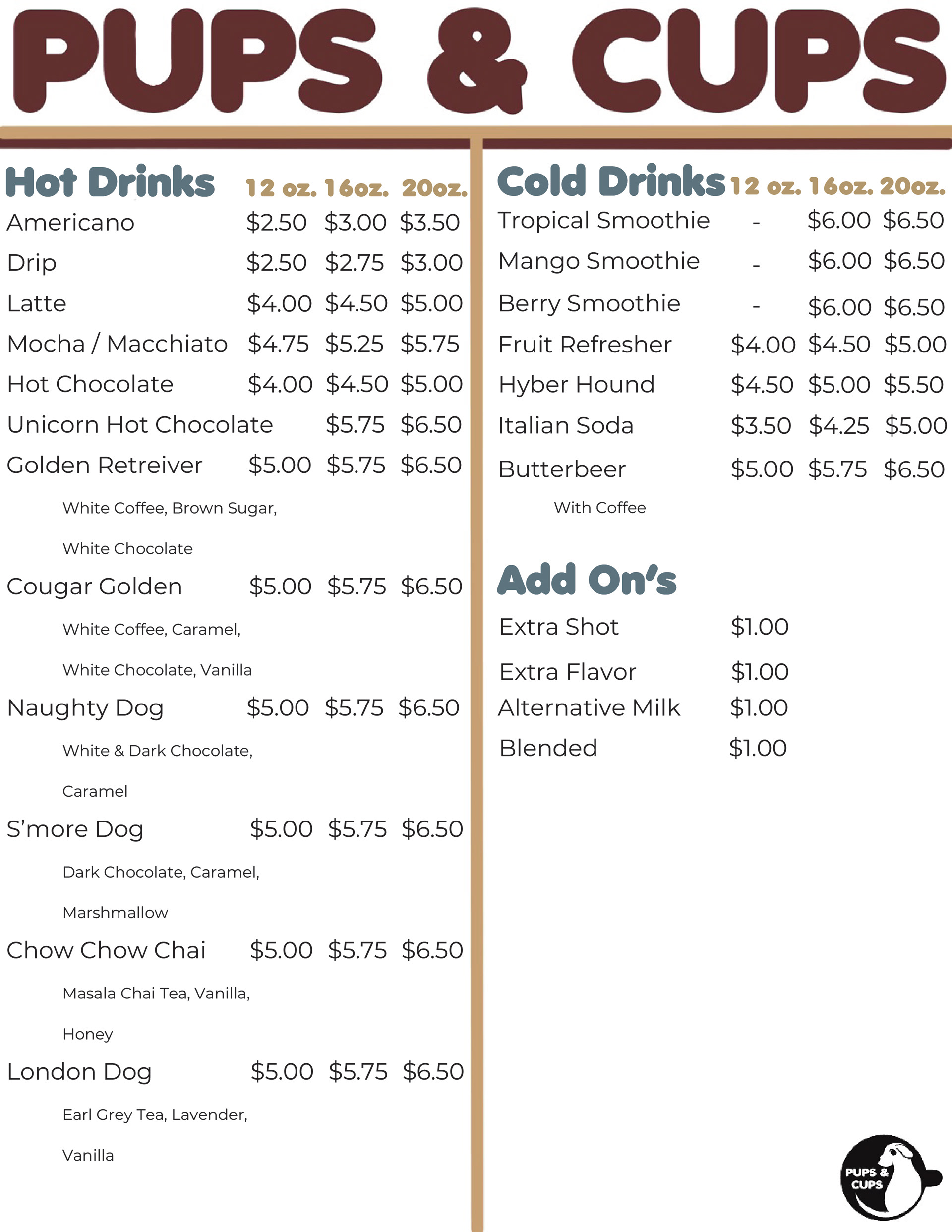
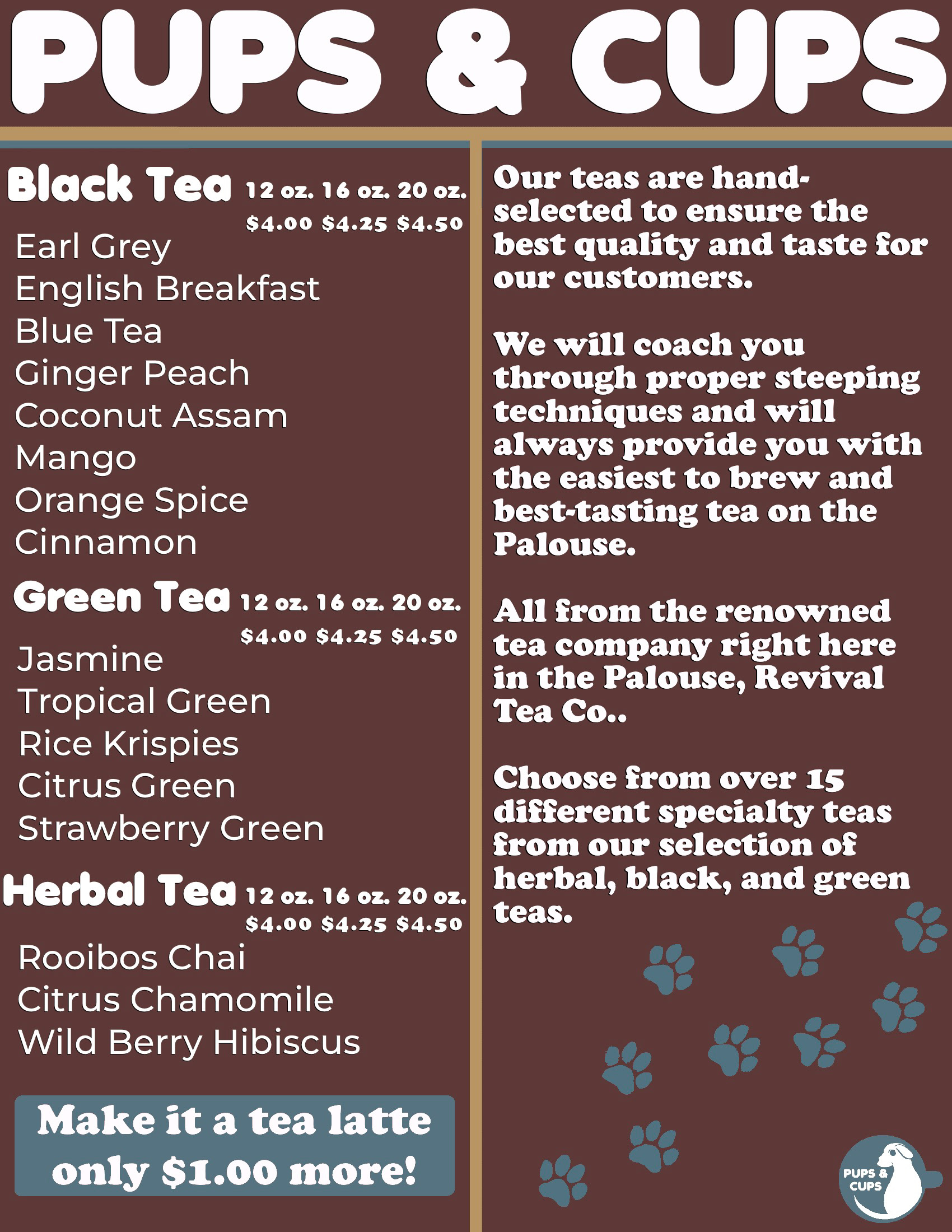
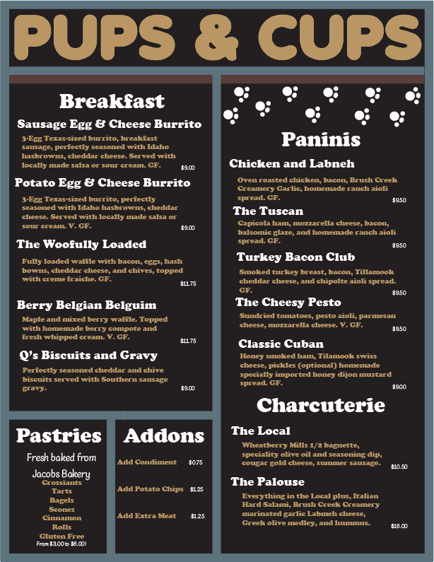
Here’s a brief description of what each of us did in the group. I did the food menu, did the menu mock ups, and designed the back of the menu. Gracie did the product mock ups, Tea Menu and finalized the main logo, and Elizabeth did the Coffee Menu, coffee bag mock ups and chose two of the 3 main fonts we used.
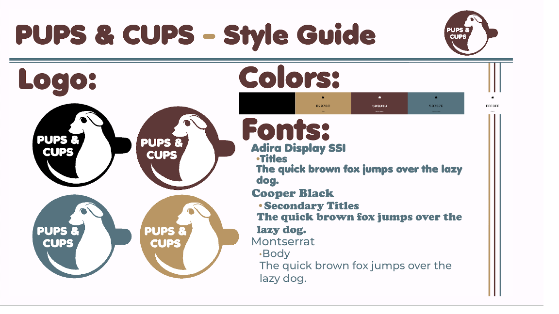
Considering the old logo, we found that the old one was super hard to look at and see it was actually a dog, along with the fact it was all over the place and lacked a hard focus on what its brand was. This made it rather hard to find an exact point the restaurant was focusing on as a coffee house or a winery. We decided to change it to focus on a coffee house, to help theme everything and keep it consistent. I think this redesign was a huge success because it allowed us to have a very solid color theme that we all decided on, a very solid idea of how we wanted to make the menus and the product’s mock ups.